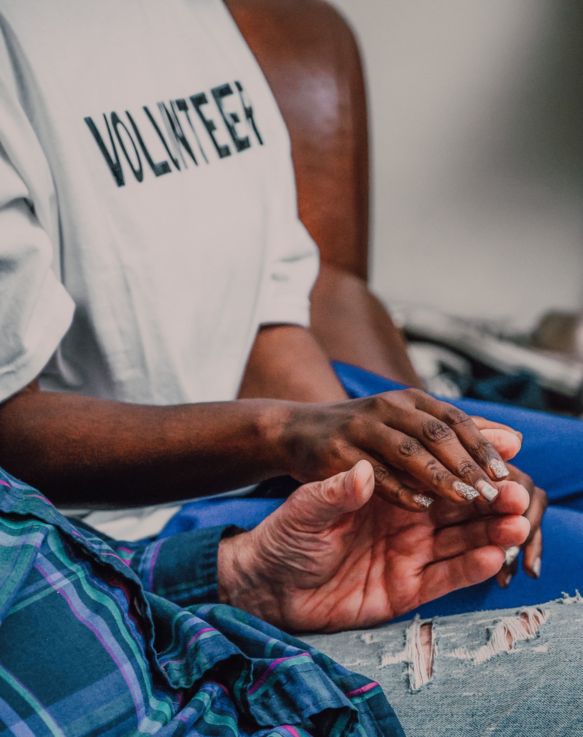
SOEN6222 POE Part 1: Software Requirements & Application Development
A full non-profit platform with four distinct role-based portals, volunteers, beneficiaries, staff and administrators, specified and designed as one coherent system, not a donation page with extras bolted on.
Role
UI/UX Designer & Requirements Author
Program
BSc, Computer Application Development, Varsity College
Tools & Methods
Figma · Software Requirements Specification · Multi-role information architecture
Project Context
Most charity-site briefs stop at a donation button. Helping Hands started from a full Software Requirements Specification defining exactly what the organisation needed to run: volunteers who sign up for outreaches and log hours, beneficiaries who apply for aid and get vetted before they're accepted, staff who coordinate resources and log outcomes after every outreach closes, and administrators who oversee donations, wages and the underlying database. That's four genuinely different logged-in experiences off one shared public site, not one homepage with a form bolted on.
Two Sign-Ups, Two Trust Levels
Becoming a beneficiary is not a simple sign-up. Applicants submit an organisation name, address, contact details, a description of what aid is needed, at least three references, and evidence of legitimacy. That application goes to an administrator for manual review, and only once accepted are login credentials auto-generated and emailed out, a deliberate layer of friction that protects the organisation and its actual beneficiaries from bad-faith applicants exploiting a public-facing aid request form. Volunteer registration, by contrast, is a standard credentialed sign-up with enforced password-strength rules. Asking someone to volunteer their time is a fundamentally different trust transaction than asking someone to disclose a need, and the spec treats them as two separate systems rather than one form with a role toggle.
Visual Identity, On Purpose
The visual identity leans warm on purpose: a hand-drawn logo, an olive-and-cream palette, heart-shaped value tags for Compassion, Community, Empowerment, Accountability and Dignity, because the audience on the other side of that beneficiary application is a person disclosing a need, not just a donor browsing a cause. The interface needed to read as approachable and human rather than clinical, without losing the operational rigour underneath it: staff and administrators still needed a system that could genuinely run outreach logistics, track resources, and keep a transparent donation record.
Design Decisions
What's actually going on
One login, four destinations, one validated account type
A single login system checks whether the user has a saved account and, if so, what type it's linked to, Volunteer, Beneficiary, Staff or Administrator, then routes each to an entirely different portal. Volunteers see open outreaches needing help, a messaging page to reach staff, and their own logged hours. Beneficiaries see the outreach progress tied to their case, resource and donation tracking, and a messaging thread with the team. Staff see every past, current and future outreach the organisation has run. Only administrators see donation transactions, staff wages, and the full database; the spec is explicit that financial visibility doesn't get shared, even with staff.
Registration as two distinct funnels, specified separately
Volunteer registration validates a username, email and password against enforced rules, at least one lowercase letter, one capital, one number, one special character, and logs the user in automatically on success. Beneficiary registration is a full vetted application: organisation name, address, phone number, a description of the aid needed, three references, and evidence of legitimacy, routed to an administrator for review before any account exists. If denied, the applicant is notified by email; if accepted, their information is saved, a username and password are auto-generated, and they're notified with login credentials and the option to update them from their profile.
Outreach management as a shared operational record
Staff can create, read, update and delete outreaches directly against the database, name, date, time, location, resources needed, volunteer capacity, budget, with different fields visible to different user types (a volunteer sees whether more hands are needed; an administrator sees the budget). Once an outreach closes, staff who participated are prompted to log recipients helped, volunteers who attended, and resources used, so the record updates itself as work happens instead of depending on someone writing a report afterwards. Administrators separately control which outreaches are visible on the public site.
A user profile built around visibility control, not just data
Every account type gets the same underlying profile system: an optional about section capped at 200 characters with a content filter, an optional profile photo up to 20MB, and the ability to update login credentials under the same validation rules as initial registration. What differs by design is what other users are allowed to see of that profile, since a beneficiary's contact details and a staff member's internal notes have very different privacy requirements even though they live in the same underlying table.
Donations handled at arm's length, deliberately
The public donations flow collects full name, banking details, date of birth (validated as 18+), email and a country-validated phone number, then hands the transaction off entirely to a third-party payment processor that validates and handles the banking details; Helping Hands never touches or stores payment information directly. What the organisation does keep, by requirement, is a full internal record of every completed donation and what it was allocated to, so administrators can maintain accountability over how funds are used, even though the money itself never passes through their own system.
The Work
Screens & process
Takeaway
This is the project that first pulled me toward client-facing UX work: writing the requirements spec before designing a single screen, then designing four genuinely different portals for four genuinely different people off one shared system, with permission boundaries that actually hold up. It's a close cousin of the client-reporting and account-management work I do now, understanding exactly who's allowed to see what, and why, before you ever open Figma.