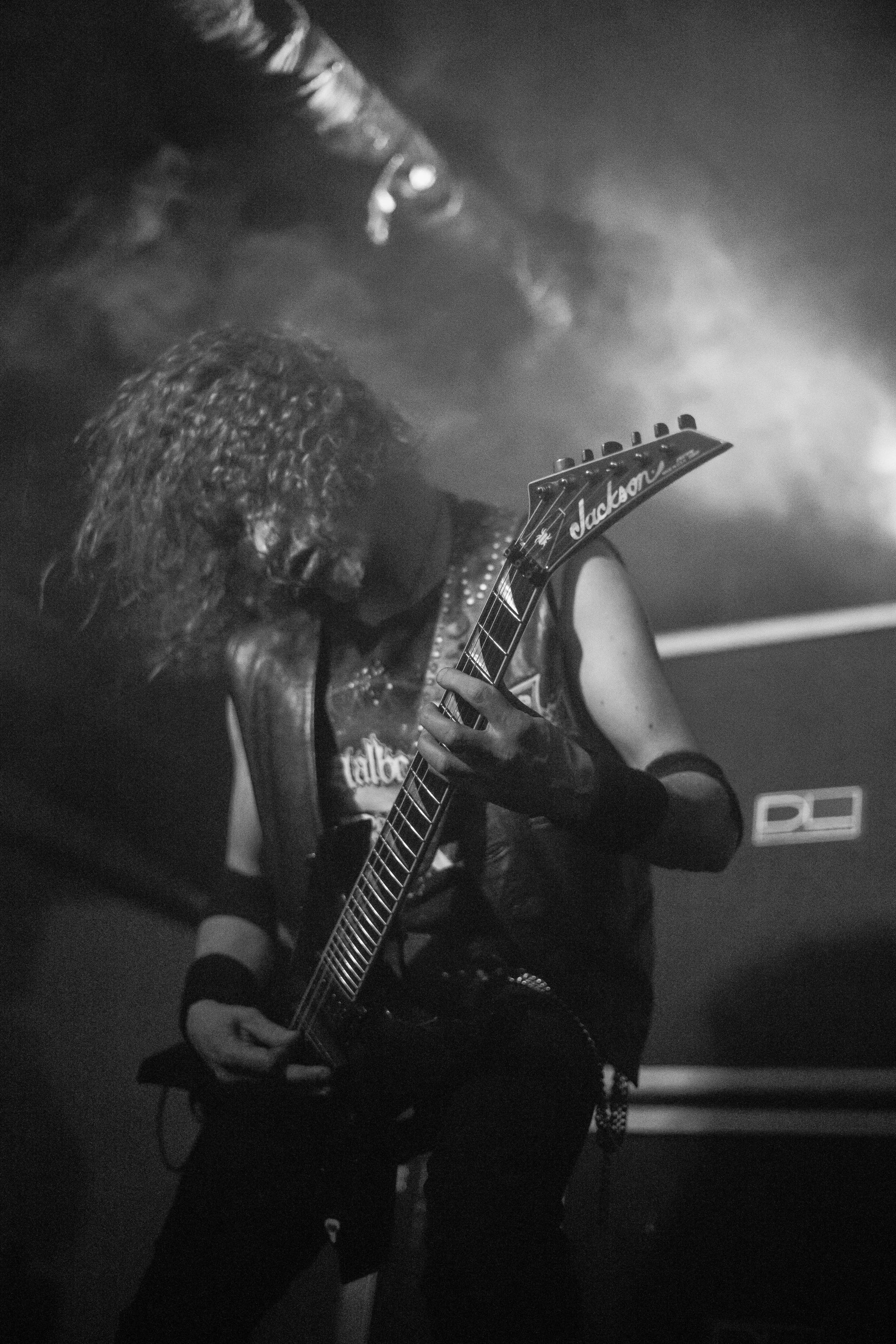
UXDE8411 Practical Project 2: Interface Design
A single-page landing and registration site for a curated metal and alternative music event, designed to be both fast and industrial-credible, without apologising for either.
Role
UX/UI Designer
Program
Postgrad Diploma, UI/UX, Vega School
Tools & Methods
Figma · Mood boards & creative rationale · Task flow iteration · Mobile-first design
Project Context
DISTORTION: VOL 1 is a landing page for a curated metal and alternative live music event, conceived for Cape Town's underground scene: the converted warehouses and loading docks in Woodstock and Salt River where DIY gigs actually happen, a community mainstream entertainment platforms have always treated as an afterthought. A thriving underground built around venues like The Toad, The Assembly and Arcade Empire sits alongside a broader entertainment industry that defaults to sanitised, mainstream-friendly presentation. When a local metal fan opens an event page and sees a polished sans-serif and a pastel gradient, it doesn't just look wrong, it reads as a signal that whoever built it doesn't know the scene, doesn't live in it, and almost certainly doesn't respect it.
The Persona
Liam Jones, 28, is an alt-scene veteran and freelance photographer with high subculture literacy and close to zero tolerance for inauthenticity. For Liam, visual credibility is a trust signal he reads before a single word of copy, and the Aesthetic-Usability Effect works in his favour here: because the visual language aligns with his lived experience of the scene, he extends more tolerance to minor usability friction, since the interface feels like it belongs to a world he recognises.
Two Constraints, Both Non-Negotiable
The brief was demanding on a second axis entirely separate from tone: the same user who needs the surrounding environment to feel culturally credible also needs the registration and ticketing flow to be fast, mobile-first and frictionless. If the site feels corporate during the atmospheric sections, that mistrust carries straight into the conversion flow and drops it. Every functional decision therefore carries a dual responsibility: it has to work fast, and it has to feel right, and those two constraints were treated as equally non-negotiable.
Design Decisions
What's actually going on
A deliberate chromatic pivot away from red
The palette leans into cool teals, moss greens and industrial cyans instead of the high-saturation reds that dominate mainstream metal branding, grounded in the environmental reality of the scene itself: underground basement gigs in converted warehouses are lit by harsh, cool-toned flash photography and industrial fluorescents, not warm stage lighting. Red signals "heavy metal as genre marketing"; teal and moss signal someone who has actually been in that room. For a user with Liam's subculture literacy, that distinction operates as a trust signal before he reads a single word of copy.
Texture as a credibility signal, not decoration
Duct-tape overlays, CRT screen distortion, fishnet patterns and recycled paper grain are direct references to the DIY material culture of metal and alternative fashion, where aesthetic value comes from repurposing and deliberate imperfection rather than polish. In UI terms these function as digital affordances for authenticity: the interface shows its process, the way a zine does, rather than hiding it the way a corporate brochure does. The typography carries the same logic through to the functionally critical layer: a "bleeding print" style with ink smudges and controlled distortion mimics DIY flyer culture while staying legible, applying distortion only to decorative letterforms while keeping body copy and form labels clean. There's a real difference between broken and intentionally rough, and the typography lives in the second category.
Mobile-first, guest-checkout ticketing
The registration flow defers account creation entirely, offering a guest checkout that asks only for essentials at the point of purchase and defers profile completion to a post-confirmation email, a direct application of Hick's Law, where minimising initial choices reduces friction at the exact point of conversion. Ticket tiers (Early Bird, General Admission) are shown as large selectable cards with clear visual states rather than a cramped dropdown, applying Fitts's Law: bigger tap targets reduce the effort needed to acquire the button accurately, and comparing two cards is instantaneous where scanning a dropdown is sequential.
Scarcity that's honest, not theatrical
Instead of a countdown-timer trick that reads as manipulative in a community-driven context, a real-time capacity tracker displayed as a proportion, "347/800," drives urgency using the Scarcity Principle without resorting to predatory pressure tactics borrowed from mainstream ecommerce. It's a number the event can actually stand behind, which matters more to this audience than it would to a typical retail customer.
A sticky CTA and scannable logistics, built for a mobile reader
A persistent CTA button stays visible through the full vertical scroll, so the primary conversion point is never more than one tap away regardless of how deep a user has scrolled into artist bios or the manifesto, a direct application of the Von Restorff Effect, keeping the one action that matters visually distinct from everything competing for attention. The "Know Before You Go" section on age restrictions, bar facilities and mosh-pit safety is written in scannable, sentence-level blocks rather than dense paragraphs, applying Information Foraging Theory so an anxious first-timer can resolve "will I be safe here" in under ten seconds.
Two task-flow iterations, kept and compared
The first registration flow (Flow A) forced full account creation before checkout, buried critical information inside a modal overlay, and gave a generic confirmation page with no ticket detail, three distinct friction points identified and documented rather than quietly fixed and forgotten. Flow B removed the account gate entirely, replaced it with guest checkout and direct ticket-tier selection, and closed with a dynamic success message and an on-screen QR code. Both flows stay in the submission because the fix only means something next to the version it fixes.
The Work
Screens & process
Takeaway
The question this project set out to answer was whether an interface can hold visual hierarchy and genuine subcultural chaos in the same frame without one breaking the other. Keeping both the failed first task flow and the fix in the final submission was the point: a site that reads as credible to someone like Liam still has to convert a total stranger buying their first ticket, and getting there took an iteration I was wrong about first.